Our work
Back to projects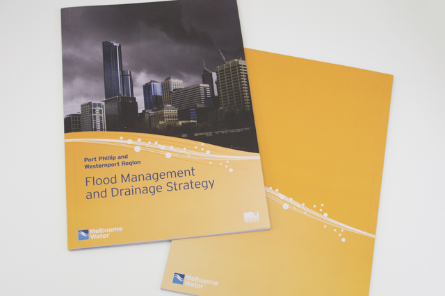

Melbourne Water flood management strategy
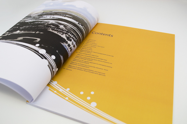
Strong and beautiful photography was complimented with expansive areas of colour linked by a bold recurring graphic edge of stylised water. This spacious layout makes what could have been a dry read into an appealing mix of history, social and economic planning.
Other work
-

Enprocal shake
Designed for nutrition, this new brand needed to hit the right notes. Flavour is emphasised […]
VIEW PROJECT -

Polish consulting
A logograph is the visual representation of a word. For the Polish identity, this technique […]
VIEW PROJECT -

125 Years of the MAV
Opening up the safe revealed the treasures of the Municipal Association of Victoria. The maps, […]
VIEW PROJECT -

Worldly Weddings exhibition
The idea of paper dolls combines with our signature in-house illustration style to make a […]
VIEW PROJECT