Our work
Back to projects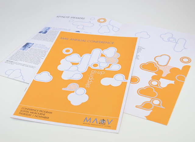
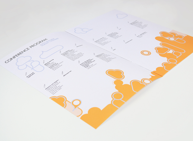
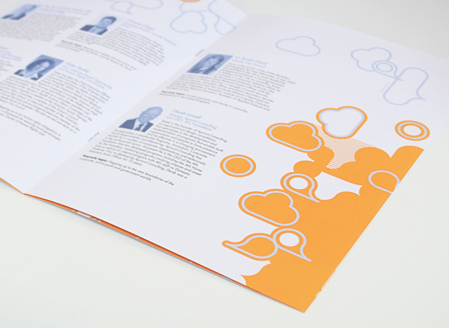
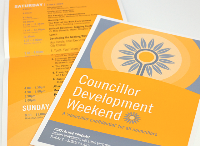
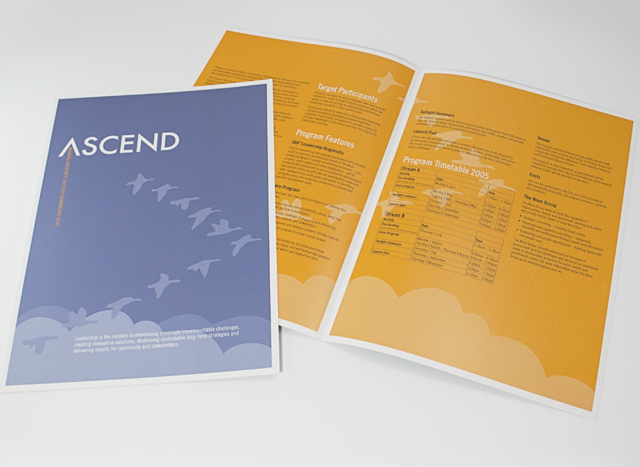
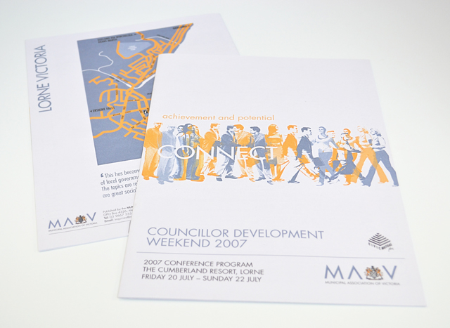
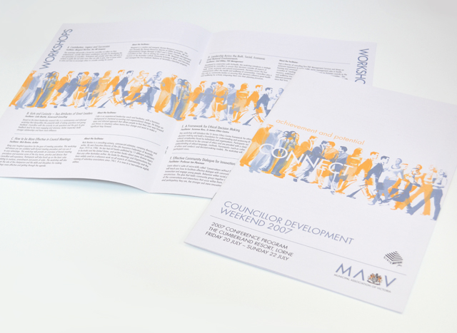
MAV publications suite
Use of two colours and bold graphics made a varied suite of printed material a unified group. We created strong vector elements to inject interest in corporate collateral promoting professional development programs, conferences and initiatives. Concentrating on yellow and silver blue, this unusual approach to corporate communications took tight timing and scarce photographic resources out of the equation, creating an identity with a bold graphic language.
Other work
-

Bouncing Back booklet
Bouncing Back is designed for parents and children who have experienced family violence. The booklet […]
VIEW PROJECT -

Spencer & Nash stationery
Visual identity for a boutique stationery maker. The modern yet elegantly detailed ethos of the […]
VIEW PROJECT -
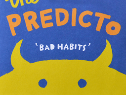
The Amazing Predicto
Lots of colour and a very simple hand drawn style are at the core of […]
VIEW PROJECT -
Yoplait Star Wars tubs
This popular TV series is turned into the latest Yoplait brand. Each 6 pack features […]
VIEW PROJECT