Our work
Back to projects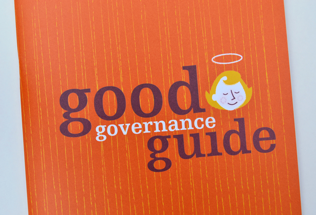
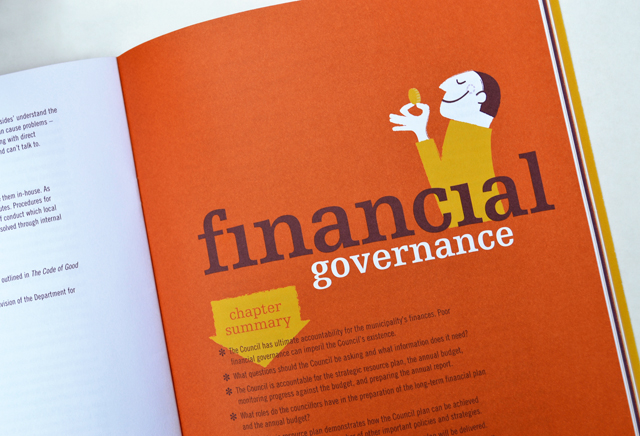
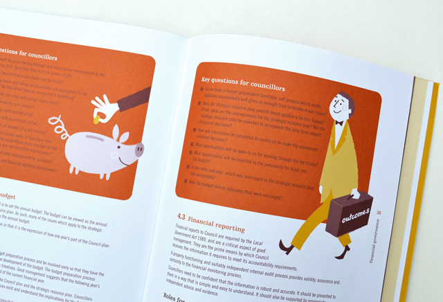
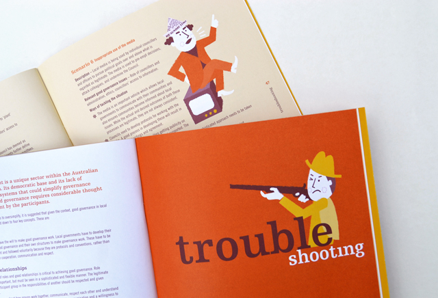
MAV Good Governance Guide
By injecting a healthy dose of personality, an extensive manual on governance is able to hold the reader, section after section, with refreshing original illustrative introductions and feature panels. These elements are partnered with typography that keep the information lively and accessible. High demand by members has led to several reprints of this publication.
Other work
-

Sinclair Walker identity
This sophisticated identity is based on the humble brick. Three colours offer the stationery set […]
VIEW PROJECT -

DSE annual report
Clean, clear sections with generous use of space create easy to find points of navigation […]
VIEW PROJECT -
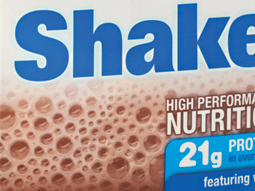
Enprocal shake
Designed for nutrition, this new brand needed to hit the right notes. Flavour is emphasised […]
VIEW PROJECT -

Finance Market identity
The Finance Market brand uses the idea of money as its identity. The stylised graphic […]
VIEW PROJECT