Our work
Back to projects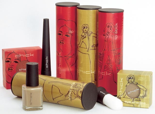
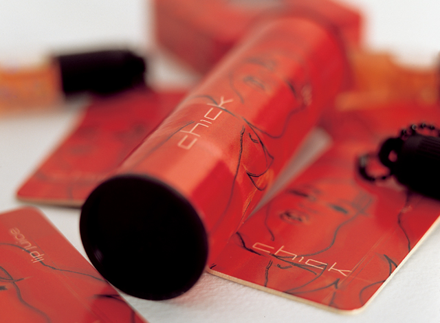
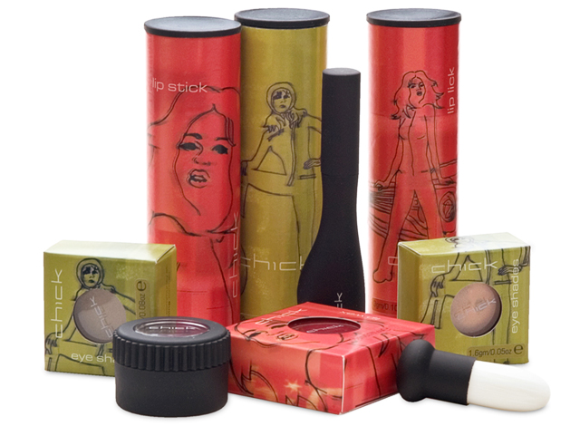
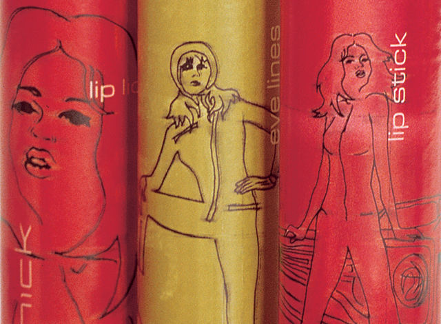
Chick cosmetics
The mid-teen, street and surf group are a fussy, fussy bunch. To simply call this niche, is to underestimate the value of getting the message right. We took the need for an original approach as far as designing a new card tube with end caps for the core range of packaging, that rolls through a counter display. A roughly produced base of colour under a traced-effect series of illustrations covers the tubes and boxes of the Chick range.
Other work
-

-
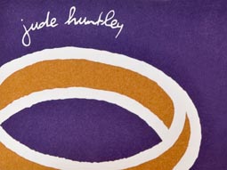
Goldsmith identity
Identities have a job to do. For this goldsmith producing bespoke jewellery, that story is […]
VIEW PROJECT -
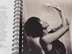
Australian Ballet diaries
Exposure to the lesser known life behind-the-scenes of the Australian Ballet was the purpose of […]
VIEW PROJECT -

Bouncing Back booklet
Bouncing Back is designed for parents and children who have experienced family violence. The booklet […]
VIEW PROJECT