Our work
Back to projects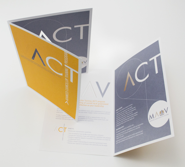
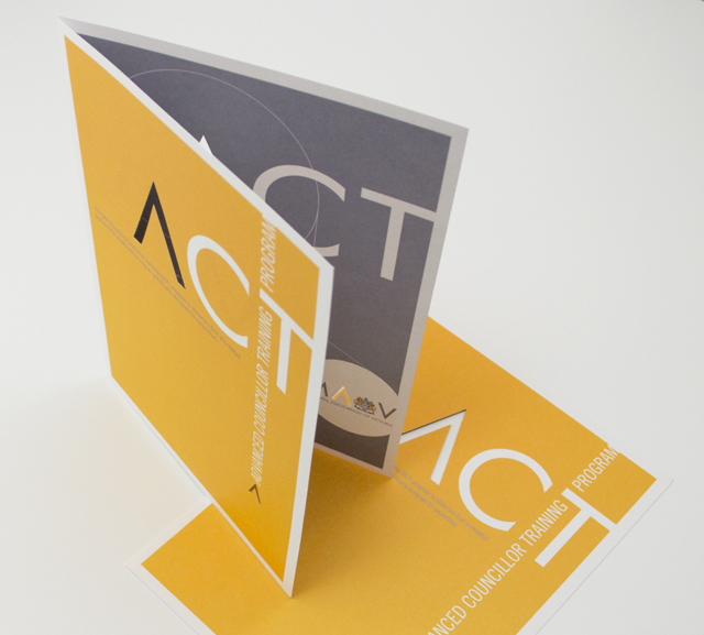
ACT flyer
Typography is often an under utilised element in pieces of communication. Making more of the words on paper builds-in their meaning and purpose. Creating the identity for a program in this way also reduces the need for additional elements. The pièce de résistance was forme cutting the A graphic through both pages. This delivered a strong character for this piece that reinforces the A’s recurring presence through the suite of documents we have created for the MAV.
Other work
-

Finance Market identity
The Finance Market brand uses the idea of money as its identity. The stylised graphic […]
VIEW PROJECT -
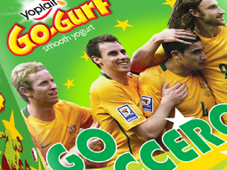
Yoplait Go Gurt Socceroos
This healthy snack in a 6-pack reinvents its look to bring the excitement of a […]
VIEW PROJECT -
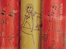
Chick cosmetics
The mid-teen, street and surf group are a fussy, fussy bunch. To simply call this […]
VIEW PROJECT -

DSE annual report
Clean, clear sections with generous use of space create easy to find points of navigation […]
VIEW PROJECT