Our work
Back to projects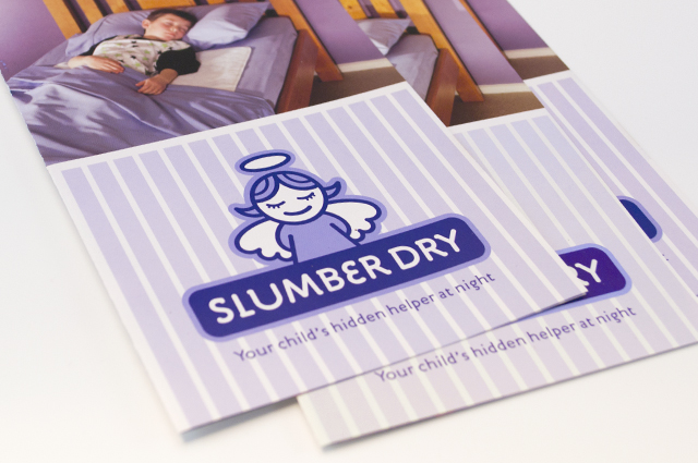
Slumber Dry identity
We created an identity that develops a straightforward product further, to reassure the parents purchasing it. A guardian angel captures this idea and creates a unique position for the brand, away from the less engaging clinical approach of the competition.
Other work
-

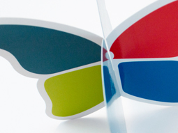
Spencer & Nash stationery
Visual identity for a boutique stationery maker. The modern yet elegantly detailed ethos of the […]
VIEW PROJECT -

Table Wrap events
Tablewrap organise and present unique and memorable events. This brochure, presented to their prospective clients, […]
VIEW PROJECT -
Queen Elizabeth Centre
The Queen Elizabeth Centre provides support, care and education to families. Describing this important goal […]
VIEW PROJECT -
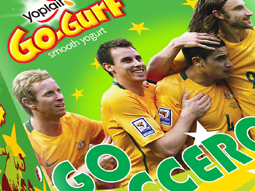
Yoplait Go Gurt Socceroos
This healthy snack in a 6-pack reinvents its look to bring the excitement of a […]
VIEW PROJECT