Our work
Back to projects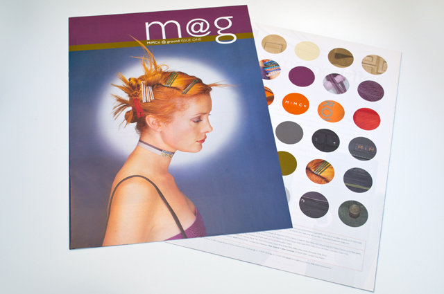
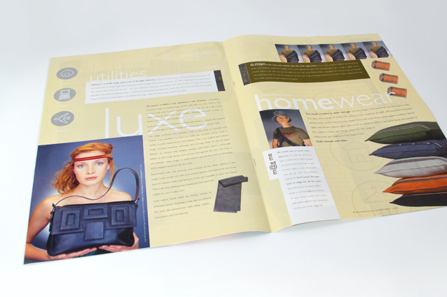
Mimco mag
This publication contained a catalogue and was used as an introduction to the company at trade shows. Combining the right colours the right way was critical, especially for this audience. A generous use of space allows the product images to form the design of each page.
Other work
-

Polish consulting
A logograph is the visual representation of a word. For the Polish identity, this technique […]
VIEW PROJECT -
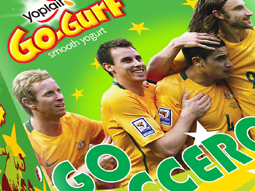
Yoplait Go Gurt Socceroos
This healthy snack in a 6-pack reinvents its look to bring the excitement of a […]
VIEW PROJECT -

Back to Action chiropractic
A strong, vital image for a sports-oriented chiropractic organisation.
VIEW PROJECT -
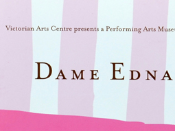
Dame Edna book
There is style and glamour, and then there is Dame Edna. Telling the Edna story […]
VIEW PROJECT