Our work
Back to projects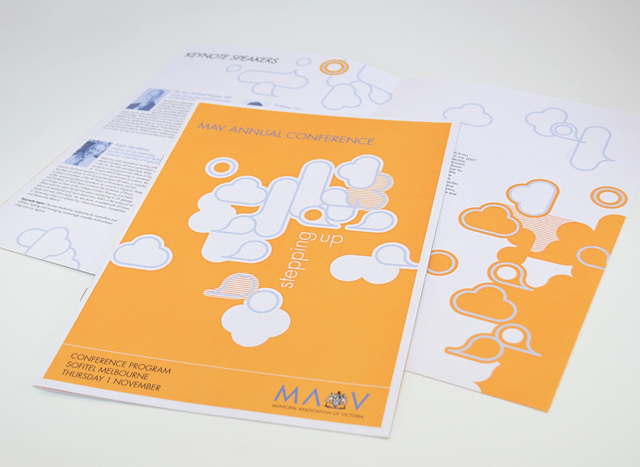
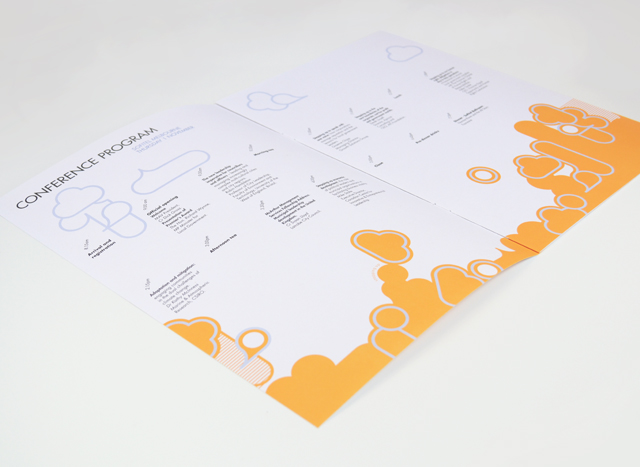
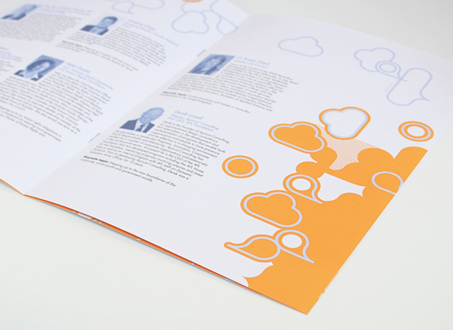
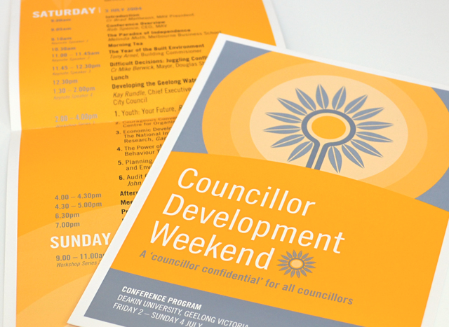
MAV publications suite
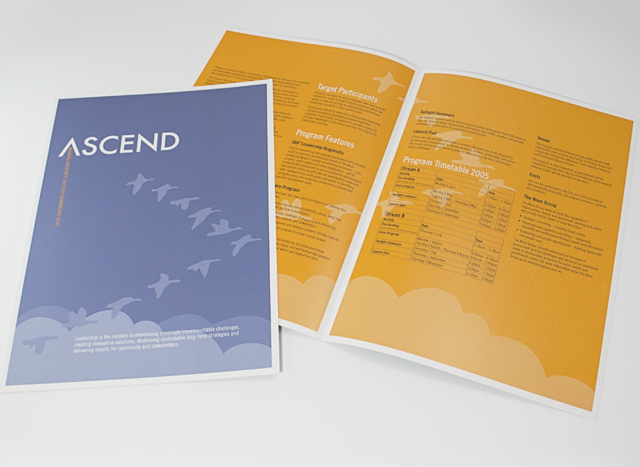
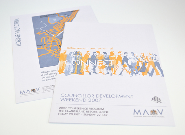
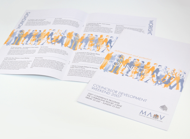
Use of two colours and bold graphics made a varied suite of printed material a unified group. We created strong vector elements to inject interest in corporate collateral promoting professional development programs, conferences and initiatives. Concentrating on yellow and silver blue, this unusual approach to corporate communications took tight timing and scarce photographic resources out of the equation, creating an identity with a bold graphic language.
Other work
-
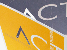
ACT flyer
Typography is often an under utilised element in pieces of communication. Making more of the […]
VIEW PROJECT -
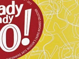
Arts Centre Ready Steady Go!
This fond glimpse at the early days of rock ’n’ roll in Australia, features the […]
VIEW PROJECT -
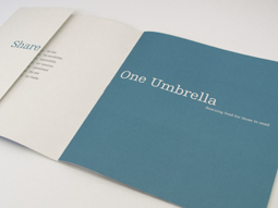
One Umbrella annual report
People working for other people was the focus of this annual report for a food […]
VIEW PROJECT -
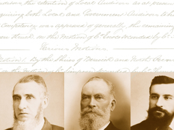
125 Years of the MAV
Opening up the safe revealed the treasures of the Municipal Association of Victoria. The maps, […]
VIEW PROJECT